Over the first six posts, I built the foundation needed to understand how civilizations change. I explored the seven domains that shape collective life, the forces that move within them, the thresholds that mark historical turning points, and the three drivers that push systems toward those moments. With that groundwork in place, I introduced a pair of gauges that make those movements easier to see. In this post, I describe the gauges in greater detail. TSDS reflects how much energy sits across the seven domains. AD shows how that energy is arranged. Before we apply these gauges to the long arc of history, we need to explain how they were built. Every measure rests on a set of choices. This post walks through those choices in a way that keeps the gauges intuitive while grounding them in the history they aim to describe.
The purpose of TSDS and AD is not to create a mathematical model of civilization. It is to provide a stable way to interpret pressure: when more domains activate, how their movements interact, and what those interactions mean for the structure of life. The mechanism behind these gauges is straightforward, but it must be clear and transparent so that the next post, where the actual scores are revealed, can stand on solid footing.
The foundation is the same seven domains that structure my research: science, technology, society, geopolitics, economics, philosophy, and the environment. These domains behave differently in each age. Some remain quiet for long stretches. Others become active and influential. Sometimes only a few domains accelerate, creating friction between fast and slow areas of the system. Other times several domains accelerate together, tightening the system and increasing the speed at which pressure moves.
To compare these patterns across ages, we need a consistent activation scale. The scale must be simple enough to use across thousands of years and expressive enough to reflect real differences in how active the domains were. A 1–5 scale serves that purpose. Each level represents a recognizable pattern in the historical record.
Domain Activation Scale
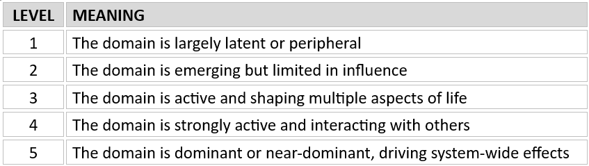
The score reflects relative historical intensity. It is not a measure of productivity or technological sophistication. Instead, it captures how much a domain shaped the architecture of life inside a given age. Currents such as literacy gains, scientific experimentation, or trade expansion help illustrate what activation looks like within a domain, but they do not replace the domain as the unit of analysis. Activation always remains a domain-level concept.
Once each domain is scored on this scale, TSDS emerges naturally. It is the sum of activation levels across all seven domains within an age. TSDS helps reveal how much system-wide movement existed. When TSDS is low, only a few domains are active and life tends to feel predictable. When TSDS is high, many domains are active at once, the system becomes more interdependent, and daily life often feels dense and reactive. TSDS does not attempt to forecast anything. It provides a snapshot of how much domain-level motion exists in an age and how many directions that motion comes from.
But activation alone does not tell the full story. Two ages may have similar levels of activation yet feel entirely different depending on how that activity is arranged. In some ages, one or two domains surge ahead while others remain quiet. In others, several domains move in alignment. The distribution matters because it shapes how pressure accumulates and spreads. That is the purpose of AD.
AD is calculated using the standard deviation of the seven activation values within an age. The calculation simply shows how tightly the values cluster or how widely they spread. A higher dispersion value means activation is uneven and a few domains intensify while others lag. A lower dispersion value means activation is more uniform. The meaning of low AD changes across history. The meaning of low AD changes across history. In early ages, low dispersion reflects broad uniformity: all domains sit at similarly modest levels of activation, and none pull sharply away from the others. In later ages, low dispersion reflects synchronization: several domains accelerating in closer alignment, producing a more tightly coupled system.
Reading TSDS + AD Patterns

These patterns repeat throughout history. They help explain why some ages changed slowly while others shifted more dramatically. They show why pressure built gradually in early ages and why it moved quickly in later ones. They help clarify why institutions adapted in some periods and struggled in others. TSDS and AD do not replace historical analysis. They organize it. They help translate the intuitive sense that some ages felt spacious while others felt compressed.
It is important to recognize that the scores we will use in Post Eight reflect the late-stage signature of each age, the configuration that became most visible as an age approached transition. Ages evolve over long periods. In the early part of an age, only one or two domains may dominate. Over time, other domains activate, expand, or synchronize. AD often rises as one domain moves far ahead of the rest and then falls as more domains catch up. TSDS tends to rise steadily as complexity increases. The values we use capture the pattern that best represents the late-stage structure of each age, when systemic pressure was most pronounced.
This distinction matters. For example, the Industrial Age began with high dispersion because technology and economics surged far ahead of other domains. But as the age matured, science, society, philosophy, and geopolitics accelerated and formed a more synchronized cluster. AD fell. The late Industrial signature reflects that tighter coupling. A similar pattern appears in other ages. The Axial Age shows a peak in uneven activation; the Renaissance shows dispersion beginning to narrow; the Agricultural Age shows modest but growing divergences. These patterns reflect the internal evolution of each age and help explain the timing and nature of transitions.
Activation is always interpreted within each age’s logic. The Hunter–Gatherer Age does not need the same level of scientific activity as the Industrial Age to earn a higher or lower score. Each age is evaluated based on how its domains shaped the internal structure of life at the time. This approach prevents us from imposing modern expectations on ancient worlds. It also keeps the comparisons grounded in the underlying dynamics: the rise of domain activity, the spread of that activity, and the eventual tightening that prepares the system for transition.
As we work through the ages in Post Eight, the pattern becomes clearer. Early ages show low TSDS because most domains were quiet. They show low AD because domain activity was uniformly low. Pressure accumulated slowly and locally. Middle Ages show rising TSDS and rising AD because a handful of domains intensified while others moved more gradually. This uneven activation created both momentum and friction. Later ages show high TSDS and eventually falling AD when multiple domains began moving together. These ages feel fast because the system becomes tightly coupled. A change in one domain quickly affects the others.
Understanding TSDS and AD helps explain the sensation of compression. When many domains activate and do so in closer alignment, the system feels tight. Small events carry more weight. Institutions face challenges because their inherited assumptions reflect the domain relationships of an earlier period. The gauges make that tightening visible. They translate a diffuse sense of acceleration into a clearer picture of how domains interact and where pressure comes from.
The logic behind the gauges remains simple: score each domain based on how active it was, sum those scores to understand overall pressure, and use dispersion to understand how that pressure is arranged. Together, these measures help explain why ages feel different and why certain transitions unfolded when they did. The gauges are not predictive tools. They do not identify specific events or forecast outcomes. They help us understand structure, which forces are in motion, how they interact, and how tightly they are coupled. This structural clarity matters because systemic change rarely appears as a single dramatic moment. It emerges as domain activity rises, spreads, and eventually reshapes the relationships that hold an age together.
In the next post, the gauges are applied to the long arc of civilization. By looking at how TSDS and AD shift across the Hunter–Gatherer, Agricultural, Axial, Renaissance, and Industrial Ages, we can see how systemic pressure accumulated, how domain activation evolved, and how the structure of life gradually changed. This is where the picture sharpens. Next: What the Gauges Reveal Across the Ages.
THE SERIES TO DATE
- When Systems Turn Over
- Why Everything Feels Like It’s Changing At Once
- How Big Shifts Unfold — And Where We Are Now
- Why No Single Force Changes The World
- The Three Drivers That Push Civilizations Across Thresholds
- Reading The Pulse Of A Civilization In Motion
Discover more from Reimagining the Future
Subscribe to get the latest posts sent to your email.

[…] How The Gauges Were Built: Making Systemic Pressure Legible […]
LikeLike
[…] How The Gauges Were Built: Making Systemic Pressure Legible […]
LikeLike
[…] How The Gauges Were Built: Making Systemic Pressure Legible […]
LikeLike
[…] forward on its own. We examined the three drivers that push societies across thresholds and built gauges that make systemic pressure legible. Using those gauges, we read four major transitions in the long […]
LikeLike
[…] How The Gauges Were Built: Making Systemic Pressure Legible […]
LikeLike